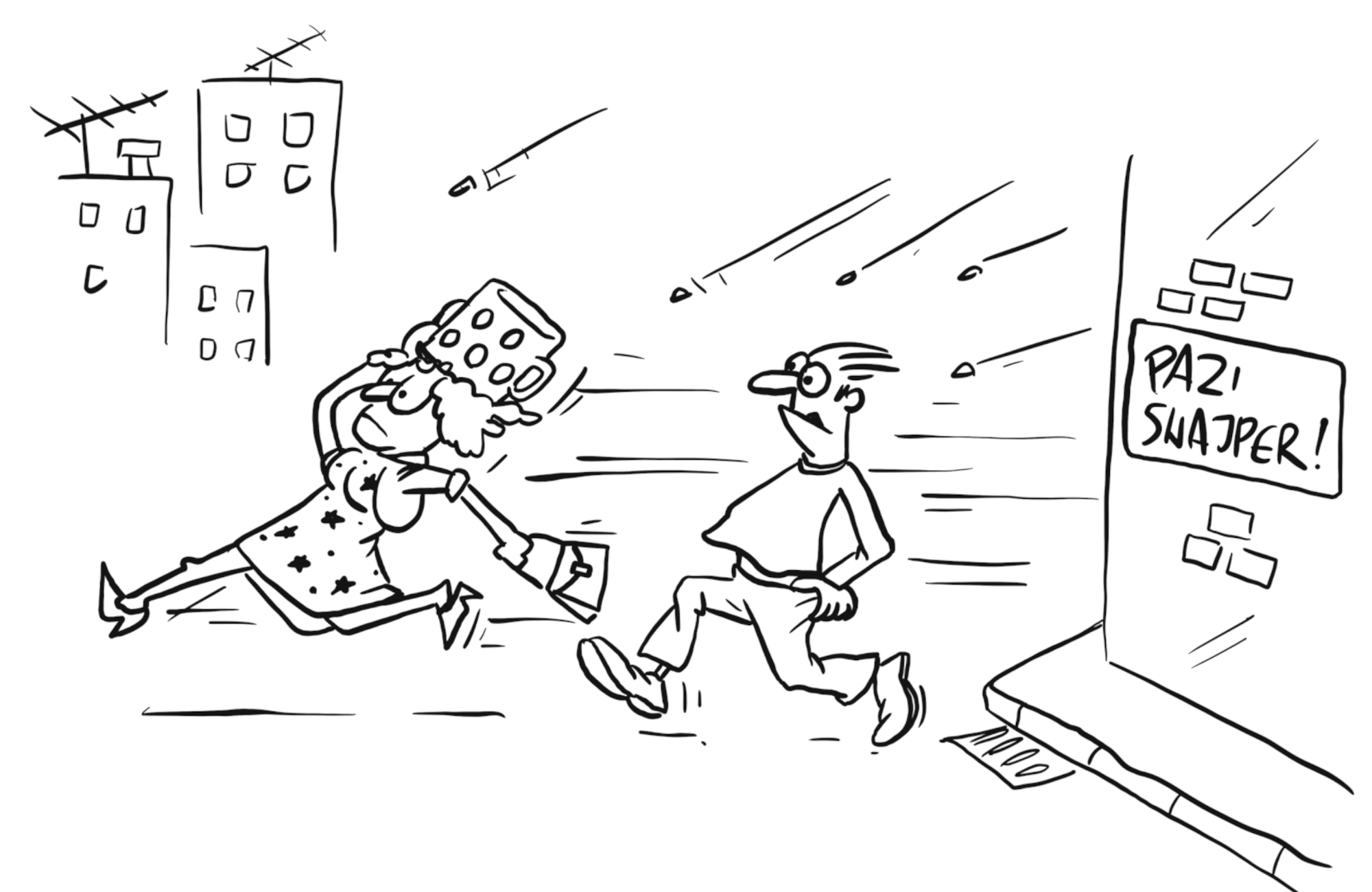
Drawings are from the book Letters from Sarajevo.
Seriously, it takes minimal fucking effort to improve this shit.
7 fucking declarations.
That's how much CSS it took to turn that grotesque pile of shit into this easy-to-read masterpiece. It's so fucking simple and it still has all the glory of the original perfect-ass website:
- Shit's still lightweight and loads fast
- Still fits on all your shitty screens
- Still looks the same in all your shitty browsers
- The motherfucker's still accessible to every asshole that visits your site
- Shit's still legible and gets your fucking point across
And guess what, motherfucker:
You never knew it, but it's easy to improve readability on your site. Here's how.
Let it breathe
Look at lines 1 and 2 of some shitty website you're building. Assuming they're not married they probably
shouldn't be humping. The defaults are trash -- pick a minimum line-height: 1.4 for body copy.
Headings should be tighter. If you can't see that...piss off.
If your text hits the side of the browser, fuck off forever. You ever see a book like that? Yes? What a shitty Sidenote content, sidenote counters allow you to easily find the sidenotes corresponding to the those counter numbers referenced in the body text. This is really helpful when you have a lot of sidenotes bunched together. book.
A little less contrast
Black on white? How often do you see that kind of contrast in real life? Tone it down a bit, asshole. I
would've even made this site's background a nice #EEEEEE if I wasn't so focused on keeping
declarations to a lean 7 fucking lines.
Size Matters
I know your partner says otherwise, but it's true. Bump that body copy to render close to 16px or more. Smaller type works well for print, not the screen.


Line-width, motherfucker
Looking at an LCD screen is strainful enough. Don't make me read a line of text that's 200 fucking characters long. Keep it to a nice 60-80 and users might actually read more than one sentence of your worthless dribble.
Yes, this is also fucking satire, you fuck
I love what the creator of this site's inspiration did. What I'm saying is that it's so, so simple to make sites easier to read. Websites are broken by default, they are functional, high-performing, and accessible, but they're also fucking ugly. You and all the other web designers out there need to make them not total shit.
"You're a fucking moron if you use default browser styles."
- Eleanor Roosevelt
Seriously, what the fuck else do you want?
You probably build websites and think your shit is special. You think your 13 megabyte parallax-ative home page is going to get you some fucking Awwward banner you can glue to the top corner of your site. You think your 40-pound jQuery file and 83 polyfills give IE7 a boner because it finally has box-shadow. Wrong, motherfucker. Let me describe your perfect-ass website:
- Shit's lightweight and loads fast
- Fits on all your shitty screens
- Looks the same in all your shitty browsers
- The motherfucker's accessible to every asshole that visits your site
- Shit's legible and gets your fucking point across (if you had one instead of just 5mb pics of hipsters drinking coffee)
Well guess what, motherfucker:
You. Are. Over-designing. Look at this shit. It's a motherfucking website. Why the fuck do you need to animate a fucking trendy-ass banner flag when I hover over that useless piece of shit? You spent hours on it and added 80 kilobytes to your fucking site, and some motherfucker jabbing at it on their iPad with fat sausage fingers will never see that shit. Not to mention blind people will never see that shit, but they don't see any of your shitty shit.
You never knew it, but this is your perfect website. Here's why.
It's fucking lightweight
This entire page weighs less than the gradient-meshed facebook logo on your fucking Wordpress site. Did you seriously load 100kb of jQuery UI just so you could animate the background color of a div? You loaded all 7 fontfaces of a shitty webfont just so you could say "Hi." at 100px height at the beginning of your site? You piece of shit.
It's responsive
You dumbass. You thought you needed media queries to be responsive, but no. Responsive means that it responds to whatever motherfucking screensize it's viewed on. This site doesn't care if you're on an iMac or a motherfucking Tamagotchi.
It fucking works
Look at this shit. You can read it ... that is, if you can read, motherfucker. It makes sense. It has motherfucking hierarchy. It's using HTML5 tags so you and your bitch-ass browser know what the fuck's in this fucking site. That's semantics, motherfucker.
It has content on the fucking screen. Your site has three bylines and link to your dribbble account, but you spread it over 7 full screens and make me click some bobbing button to show me how cool the jQuery ScrollTo plugin is.
Cross-browser compatibility? Load this motherfucker in IE6. I fucking dare you.
This is a website. Look at it. You've never seen one before.
Like the man who's never grown out his beard has no idea what his true natural state is, you have no fucking idea what a website is. All you have ever seen are shitty skeuomorphic bastardizations of what should be text communicating a fucking message. This is a real, naked website. Look at it. It's fucking beautiful.

We're not looking at a novel by Stephenie Meyer, this is a motherfuckingwebsite. Add some relevant pictures to give a little bit of context, or to cheer up the reader. Do you really like to waste the power of technology that we have nowadays? Come on, you're using a web browser on a computer, you're not reading a book on a Kindle.
The website shouldn't be overfilled with pictures, but it should make the user happy while reading your nonsense words.
You see the picture of this cute cat? He's happy, and you should be too.
Yes, this is fucking satire, you fuck
I'm not actually saying your shitty site should look like this. What I'm saying is that all the problems we have with websites are ones we create ourselves. Websites aren't broken by default, they are functional, high-performing, and accessible. You break them. You son-of-a-bitch.
"Good design is as little design as possible."
- some German motherfucker
Epilogue
Inspired by the geniuses behind motherfuckingwebsite.com and txti.
This page—that isn't a total fucking eyesore—was created by me with help from him.